Link to Carrying Capacity Dashboard (from the Queensland University of Technology).
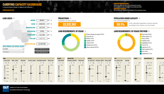
This Australian visual tool is a fantastic example of a total systems perspective being brought to bear on two common challenges - "what amount of population can be supported on a set amount of landmass?", or "what amount of landmass is needed to support a set amount of population?" While I can immediately see that the tool has limitations, this is a great way to visualise and teach total systems perspectives, to get people thinking in a different way compared with the existing mainstream political, economic and business paradigm of unconstrained growth.
This Australian visual tool is a fantastic example of a total systems perspective being brought to bear on two common challenges - "what amount of population can be supported on a set amount of landmass?", or "what amount of landmass is needed to support a set amount of population?" While I can immediately see that the tool has limitations, this is a great way to visualise and teach total systems perspectives, to get people thinking in a different way compared with the existing mainstream political, economic and business paradigm of unconstrained growth.
 RSS Feed
